 In my typography class we talked about the importance of point-of-purchase displays and how useful they can be if they are designed well. I really like this display. This is very cute. I like how it's a dog house filled with bones and toys. They made the dog house red and black just like the Milk-Bone logo. I like how it's a 360 display and people can grab products from any side. It looks like they used every part of the display they could for shelving so they can put a lot of products on the display. I like how the Milk-Bone logo is displayed on top. Most people will probably see the sign first and then the dog house. If I saw this in PetSmart or Bowman's I would walk over to it and possibly buy something.
Thursday, May 9, 2013
Point-of-Purchase Display- Milk-Bone
In my typography class we talked about the importance of point-of-purchase displays and how useful they can be if they are designed well. I really like this display. This is very cute. I like how it's a dog house filled with bones and toys. They made the dog house red and black just like the Milk-Bone logo. I like how it's a 360 display and people can grab products from any side. It looks like they used every part of the display they could for shelving so they can put a lot of products on the display. I like how the Milk-Bone logo is displayed on top. Most people will probably see the sign first and then the dog house. If I saw this in PetSmart or Bowman's I would walk over to it and possibly buy something.
Oreo Point-of-Purchase Display

I love this display. This is a great point-of-purchase display. In my typography class we talked about the design and importance of point-of-purchase displays. These displays grabs people's attention. This is a very creative display. I love the milk rushing out of the bottom and I like the giant Oreo cookie hanging off the side. It looks like you could dip the giant cookies into the milk. They have definitely branded this display. They have the word "Oreo" really big at the top and they also have it on each shelf. I like how the shelves are curved instead of straight. I think it's more effective having curved shelves because it goes with the flow of the design. If I saw this in a store I would probably go buy something off of this display. Definitely an eye catching display.
Point-of-Purchase display- Josh Groban
 This is a point-of-purchase display. A place called Lithowerks does high-quality color printing and packaging, commercial printing, custom work, inventory management, and other services. http://www.lithowerks.com/printing/gallery.html
Point-of- Purchase displays are usually in stores like grocery stores, gaming stores, and department stores. I don't think a lot of people think much about them. When people walk into a store and they see a point-of-purchase display that they like they will go to the display and usually pick the product up without even thinking about it. They catch people's attention. This display is promoting Josh Groban's new album the Closer. I think this display would be effective. I like the die-cut of the artist and I like how he is leaning on the CD part. I like the typography at the bottom, it stands at. The white text really stands out. Closer is a little hard to read, but you can tell that it's not that important or they would have made it stand out more. I can tell what part the CD's would be in. I think this is a good Point-of-Purchase display.
Wednesday, May 8, 2013
Crabby Joe's

The food titles have a white outline and a drop shadow.
I don’t have a problem with that, but I know my teacher would. You usually don’t
put drop shadows behind text. In this case I don’t think it looks bad. This is
a bold menu. I like the pictures on the side with a description at the bottom.
Most people like looking at pictures of the food so they can get an idea of
what it looks like. I like the use of the blue and yellow boxes. They put new
and important information in the boxes so they stand out from the rest of the
menu. I also like how the food items are laid out. It’s easy to read. For the
most part, I like the design of this menu.
Yahoo! Logo
 Yahoo! logo is made out of only type. Who would have thought that this logo would become famous one day. It's basically just purple type that's out of line. This logo does have movement because the letters go up and down. I can just hear someone saying Yahoooooo! I think it's a cheerful logo. It kind of looks like something a kid would draw. This logo sort of looks like it was put together quickly, but I think that was the look that they were going for. This is probably one of the worst logo designs out there. If Yahoo! didn't have the exclamation point at the end I don't think it would have been read right. I think Yahoo! used to be red and then they changed it to purple. There's not that much to say about this logo though.
Tuesday, May 7, 2013
Sal's Pizza Menu
Most pizza and Italian menus look something like
this. They have a lot of information on it. I like the coupons/ specials on the
side of the menu. I would put that on a take-out menu, but not on a dine-in
menu. I like the front cover. I like the picture and the map. I think the font
works for this menu. I like how it’s laid out. I like how the text wraps around
the pizza on the left side. On the second side, I like the use of white boxes.
It draws your attention to the white box. I think it’s a good idea to put
specials in its own place that stands out from the rest of the menu. This menu
has a lot of information on it and it is busy, but for the most part I think it
works.


Billy McHale's Kid's Menu
 This is a kid's menu. You can tell this menu is targeted towards kids. I don't think most people think about kid's menus as much as adult menus/the regular menu. I think both menus are important. A lot of adults bring their kids to restaurants and they always ask for a kid's menu. The menu as to be appropriate for kids, easy to read, and fun. A lot of kid menus have games or a picture that they can color in so they have something to do. This menu has big font and the font is definitely kid friendly. This font looks fun. The food names and prices are easy to read and find, which is good for the kid and parent. The menu is also in black and white so if kids wanted to color on it they can. They also added some design elements, which work. The only thing that isn't working is the glass at the bottom right. I don't like how the glass is cut off and the text is going on top of it. It doesn't look good. I would either make that a text wrap so the text goes around the glass or move the glass to another place.
Twin Brother's Menu
 I don't really like the design of this menu. It looks like a kid designed it and it's messy looking. I'm not sure why they chose Broadway for the font. They need to change the font. They should have a more tropical font since this place is in the Bahamas. I don't like how Daiquiris is right on the font above it- it doesn't looks good. The blue font is over the picture and it doesn't work. Almost all of the font is centered on the left side. They need to get that off centered. I like the pictures, but not where they are at. They put a picture of a glass right in the middle of "Sky Juice" and "Tropical Delights" and it's very distracting and hard to read the text around it. The picture of the ribs and fries next to "Kids Corner" isn't working. It looks like someone poorly cut it out. This menu needs to be redone.
Reggae Hut Menu

I think this menu is way too bright. I don't know who thought that neon yellow and green would be good colors for a menu. The red font isn't bad, but I don't think it works well with the background. I like the pictures, but I feel like they are just randomly put on the page. I think the picture of the lobster is way to big. It looks like they used the same font for the title and for the food description, which doesn't work. The font is okay for the title, but not for the smaller font. It makes it hard to read. This menu needs some revisions.
Monday, May 6, 2013
Catered by Kate
I like this color. It's a welcoming and bright color. This website has a homemade touch to it. I like how the white tabs aren't perfectly straight on the ends. I think the logo might look better on the left hand side. Her logo is hard to read when it's small. Her logo is too busy and the font doesn't work that well. I like the white text in the background, but most of it is covered by the picture. I like how she made the word "touch" in red so it stands out. It is also the same color as "Home." I don't think this is a bad designed website, but I do think it needs some more work. 
Sunday, May 5, 2013
Poorly Designed Menu
This menu is poorly designed. I don't like this menu. Everything is centered. I know it's in a different language, but that doesn't matter because it's still a bad layout. I don't understand why the price is underlined with dots. They should either put the price next to the food items or have dots that goes from the food name to the price. They should make the titles off centered. There isn't a lot of font variation. The titles look like the are almost the same size as the food names. They should make the titles bigger and bolder. The font description on the last page looks different than the other pages. The font looks like it's a regular font instead of bold. I think they should use that font style on the first two pages and that way it will have more consistency. The background could work if the layout was stronger. It seems like the background is more important than the food names. This menu needs some work.

Sedam Bisera Resturant Design Menu

http://sedambisera-restaurantdesign.manifo.com/
This is Sedam Bisera Resturant Design located in Italy. According to their website they help restaurants by redesigning elements to make the restaurant more successful and better. I like the design of this menu. I like the border around it. I also like the very low opacity city in the background. Some people may find that distracting though. I like the typography on this menu. I like that they made the food titles brown to match the background. I like that they included pictures. I like menus that have pictures on it because I like seeing what the food looks like. I like how the text wraps around the pictures. I don't really like the green for the side information. I think they should have used the brown from the titles. It looks like a puke green. The only thing that's throwing me off about this menu is where the titles are positioned at. Some of the are centered within the white box and others aren't. Veal Entrees is squished to the side. I think they need to make the picture of the veal smaller, so the title fits in better.
Christine's Caribbean Cuisine's Menu

This is Christine's Caribbean Cuisine's menu. This restaurant is in Riverview, Florida. I really like this menu. If I saw this menu from a distance I would definitely look at it. I love the colors and the pictures. This has a tropical feel to it. This menu makes me wish I was in Florida. I like how the colors and the pictures are mixed in together and I like the texture around them. I like how some pictures are behind the descriptions and others are in front. This menu has a lot of movement. I also like the typography on this menu. It looks like they used the same font for the food items, but used variations of that font. I like how the food titles are in all capital letters, bold, and bigger than the other font. The food items are also in capital letters, but in a smaller font. I like the use of dots that goes from the food item to the price. It is easy to follow and read. I like how they didn't use dollar signs. I also like how they put that "lunch is served 11am-3pm mon-fri" at the bottom in big letters. I don't like the font for that sentence though. I think they should bring the "Christine's" font back in at the bottom. I like that they used a low opacity white box to put the menu items in. It helps it stand out from the background.
Friday, May 3, 2013
Amazon logo
I think amazon has a very clever logo. Either someone told me or I read it somewhere that the amazon logo is smiling. I never noticed that before until a couple of years ago. They used a basic font like arial. A lot of logos use all caps or a capital letter for the first letter and then lowercase for the rest. This is one of the few logos that I know of that uses all lowercase letters. It's very clever where they put the "simile" at too. They put a curved arrow that goes from "a" to "z." I think one of their slogans was "everything from a to z," which means that people can buy anything from a to z on their website. I like how they curved the bottom of the "z" to make it look like a dimple or make it look like it's smiling. I like that the arrow is a yellow orange color. If the arrow was black it would not have stood out as much. This is a simple logo, but extremely effective. This might be a simple logo, but it probably took awhile to come up with. Usually simple, but strong logos will stay with people longer than a complex logo.
BEHR paint can

This is one of the many different paint cans of BEHR. This is the only BEHR paint can that has papyrus font. Papyrus font usually isn't successfully used. My teacher told me to stay away from that font. It is usually used with Egyptian and nature things. The only reason I can think of why they used this font would be to make this paint can stand out from the rest, and they might have thought that this font went well with the premium plus "style" paint. I think they tried to make this paint can have more of a natural feel to it. I'm not sure why they have a thick black stroke under the "o," "a," and "t" in "topcoat." I don't know why those letters are more important than the others. I think if they wanted to keep the black underline they should have extended it across the entire word. It kind of looks like the underline is only half done. I do like the colors of this paint can though.
B & W Takeout menu
http://www.loubarnicle.com/printDesign.htm
A guy named Lou Barnicle designed this menu and he is a graphic designer. This is the Tempo take-out menu. I like that this menu is consistent. I like how he used a different font for the title of the food section and then another font for the actually names of the food/descriptions. I'm not crazy about the script font for the title, appetizers, salads, main courses, or desserts, but maybe it fits the restaurant. I'm glad that he didn't use the script font for the food titles/descriptions. For the most part I like how this is laid out. He put the appetizers and salads first on the menu and then desserts last. That's a common layout for most menus. I like how the descriptions are below the name of entrees and the descriptions are lined up with one another. I also like his use of boxes. I like how he put desserts in a low opacity gray box to help it stand out. I also think it's clever that he repeated the restaurant's logo in white behind the information in the dessert box. That means that he is branding and using the logo in more than one place. I would probably get rid of the dollar signs next to the price. I read an article that said there is no need for dollar signs next to the price on menus because people will know that is the price. Not having the dollar sign on a menu makes it seem less expensive in a way because when people see the dollar sign they know that means that they are spending money.
This is what the article said....
"Drop dollar signs. Anyone who has sat in a restaurant trying to decide what to order is a liar if they tell you they don’t look at the price for help in making a decision.
So if every customer is going to be looking at that number beside menu items, you might as well make it as appealing as possible.
A recent study by the Culinary Institute of America (the other CIA) showed that menus without the symbol “$” or the word “dollars” saw an increase in sales of over 8% per person.
That’s enough to make any restaurateur scrambling to get the white out!
In fact, deemphasize prices as much as you can. Another important tip is to place prices right next to the end of descriptions so that they blend in as opposed to setting them out all by themselves to the far right margin which just gets your customer thinking about how much it will cost rather than how good it will taste."

Wedding Menu
 This is a very elegant menu. Everything is centered, which makes it a little boring, but I don't think it's bad looking. I really like the designs in all four corners. I think the bottom 2 corner designs should be smaller because the lines are running into the desserts and that could be distracting. I think this menu looks elegant being in black and white. This is actually a wedding menu. Someone designed this wedding menu for a lady named Danielle. I think this fits for a wedding. I also like the use of the lines on the right and left side and the bottom. I think it's nice that the designer put the couple's initials at the top surrounded by the same flower design as the corners.
Sunday, April 28, 2013
Golf Menu
http://restaurantfunds.com/blog/restaurant-menu-design-more-profit-with-smarter-design
 I like this menu. It reminds me of the Greene Turtle menu/atmosphere. I like where the pictures are placed. This restaurant looks like it is a golf restaurant or has a big focus on golf because of the pictures and titles. I think the titles are clever-tee it up, sand-wedges, back nine, and the turn. I like the picture of the tee under the title because it looks like it is underlining it, but I don't like how big it is. The shadow is interfering with the first item and that might be distracting to people who are trying to read. I like how each of the subtitles are in different fonts. The menu definitely has font variation. I like how the entrees are bold and the descriptions are in a regular font. The one thing I don't see on this menu is prices. I don't know if the prices are hidden and they are too small for me to see them, but I don't think there are any prices on this menu. I hate menu without prices. I think every menu should have a price unless it's a special type of restaurant (like when you go on a cruise and they give you a menu with just the entrées and description because the food was included when you paid for your trip). Sometimes people will pick one entrée over another because of the price (usually if the one entrée is a lower price than the other one). Overall, I like the design of this menu there are just a few changes that I would make.
I like this menu. It reminds me of the Greene Turtle menu/atmosphere. I like where the pictures are placed. This restaurant looks like it is a golf restaurant or has a big focus on golf because of the pictures and titles. I think the titles are clever-tee it up, sand-wedges, back nine, and the turn. I like the picture of the tee under the title because it looks like it is underlining it, but I don't like how big it is. The shadow is interfering with the first item and that might be distracting to people who are trying to read. I like how each of the subtitles are in different fonts. The menu definitely has font variation. I like how the entrees are bold and the descriptions are in a regular font. The one thing I don't see on this menu is prices. I don't know if the prices are hidden and they are too small for me to see them, but I don't think there are any prices on this menu. I hate menu without prices. I think every menu should have a price unless it's a special type of restaurant (like when you go on a cruise and they give you a menu with just the entrées and description because the food was included when you paid for your trip). Sometimes people will pick one entrée over another because of the price (usually if the one entrée is a lower price than the other one). Overall, I like the design of this menu there are just a few changes that I would make.
Salute Kosher Restaurant Menu

This is a very plain menu. I took me a while to figure out what the picture was next to the title. The picture is of 3 skewers. I don't think the picture reads right and I don't like where it's positioned at. This menu has very little design elements. Designers try to stay away from underlining words in their design. This menu has a lot of underlining in it. This menu has the title underline, which I don't think is bad. But they also have the words "We Deliver" underline too, which I don't think looks good. They also underlined all of the subhead titles. There isn't any visual hierarchy on this menu. All of the type is pretty much the same. I think they could have made the address and number in a regular font and then have "we deliver" in a bold font with quotes. That will add some interest. The entrée names and the price is the same font and size. It also looks like the entrées and prices are in italics, unless that's just how it looks on the screen. This menu needs more variation in the font. The design is boring.
Sunday, April 21, 2013
Nestle water bottle label
This is a Nestle water bottle. I don't think it's that interesting of a design. I do like the yellow ribbons going behind the label and I like the family at the bottom. This seems like it's adverting a family friendly environment. I like the starburst design in the background- it gives the design movement. I like how the text follows the curve of the blue curved rectangle. It's not a terrible design, but it's not the greatest water bottle label design either.

Tuesday, April 16, 2013
FIJI Water
") This is a FIJI water bottle. I don't think it's as popular as other water bottle brands. I think their water bottle label is different from most water bottle labels. It has more of a tropical feel to it. I like that they used a hibiscus flower instead of the typical mountains or rivers. Their logo is mainly made out of typography. The used all capital letters and outlined the letters in yellow. They have type written in cursive above the name and type below the name in a sans-serif font. It looks they used the max of 3 fonts in a design. Cursive usually doesn't work it small designs, but I think it works in this design because the type in cursive isn't the most important information. Outlines and the color yellow don't always work and can be hard to use it a design, but I think it works in this design because it is supposed to be a tropical design. "FIJI Water is drawn from an artesian aquifer that lies hundreds of feet below the edges of a primitive rainforest.
This is a FIJI water bottle. I don't think it's as popular as other water bottle brands. I think their water bottle label is different from most water bottle labels. It has more of a tropical feel to it. I like that they used a hibiscus flower instead of the typical mountains or rivers. Their logo is mainly made out of typography. The used all capital letters and outlined the letters in yellow. They have type written in cursive above the name and type below the name in a sans-serif font. It looks they used the max of 3 fonts in a design. Cursive usually doesn't work it small designs, but I think it works in this design because the type in cursive isn't the most important information. Outlines and the color yellow don't always work and can be hard to use it a design, but I think it works in this design because it is supposed to be a tropical design. "FIJI Water is drawn from an artesian aquifer that lies hundreds of feet below the edges of a primitive rainforest.That distance and isolation is part of what makes FIJI Water so much purer and richer in taste than other bottled waters." http://www.fijiwater.com/water/ I like that FIJI design represents where the water comes from. The water bottle label looks like it is represent the rainforest. They design makes me want to go there. I like the curved blue and green lines it the background. It reminds me of water and palm trees. I think this label has a relaxing and calming feel to it. I think this is a well-designed water bottle label.
Friday, April 12, 2013
Dasani
 This is Dasani's water bottle label. Dasani is fairly well-known. I think most people know what their water bottles look like. Their logo is based on typography rather than illustrations. I like what they did with the "S" in their name. It looks like they created their own font. I like the curved line going in the middle of the "A." I like that the "S" is different from the rest of the letters. It kind of looks like water dripping down. I like that it is curved rather than blocky. I also think the colors work well. The letters are white with a dark blue outline and a light blue streak inside the letters. I think the textured background also works well. I like how the background goes from a light blue to a darker blue. I also like that they put their own recycle sign and that it's redesigned plastic in green on the front. I think that's important to know. I like when water bottles or any type of products goes eco-friendly. I have to design a water bottle label made out of only type. I think this is a good example of typography.
Friday, April 5, 2013
Poland Spring Water
 This is a Poland Spring water bottle. It relies more on the illustrations than the typography, which is fine. I have to design a water bottle label using mainly typography though. I like the illustration on this water bottle. I like the rushing water going into the distance. I think their logo, which is mainly type is fairly well-known. It's a little hard to read the "P" in Poland. It almost looks like an "O." I would change the "P" in Poland to look more like a "P" than an "O." I also think the yellow curved banner adds a nice touch to the logo. It kind of looks like it's smiling. I think it's a good idea to put when the company was established. I see that on a lot of water bottles. In this case this company was established in 1845 and they put that right underneath the "S" in Spring.
Aquafina Water Bottle
My next project for typography is that I have to create a label for a water bottom. The label is only 8x2 in, so it's small.
Aquafina water bottles are pretty common. They are known for their blue mountains and red sun. When people see this water bottle they will know the brand. I think this label has an equal balance of typography and illustrations. I think it might be slightly more heavy on the illustrations. I like their logo and typography. I like how the tail extends off of the "Q" and goes into the red line. They stuck with a blue and red color scheme. I also like how they put on the back that the bottle uses 50% less plastic. I like this water bottle label design.

Aquafina water bottles are pretty common. They are known for their blue mountains and red sun. When people see this water bottle they will know the brand. I think this label has an equal balance of typography and illustrations. I think it might be slightly more heavy on the illustrations. I like their logo and typography. I like how the tail extends off of the "Q" and goes into the red line. They stuck with a blue and red color scheme. I also like how they put on the back that the bottle uses 50% less plastic. I like this water bottle label design.
Monday, March 25, 2013
Wired magazine
 Each magazine has it's own typography. The most important typography is the title of the magazine. Wired's font reminds me of the "Earwig Factory" font. When people see this magazine they are going to recognized it because of the consistent typography. They used a sans serif font for the title and for the blurbs. There font is bold and big. Wired magazine has articles about science, gear, entertainment, business, security, and design. I think the font choice for the title fits well. It looks like the designer used the same font for the blurbs. I noticed that they left-aligned the blurbs on the left side and center the blurb in the center, which makes sense. Typography is very important in magazines, especially for the cover.
Tuesday, March 19, 2013
Redesigned book cover_1984

Taxi
 I first saw this book cover in class. This is a good example of typography. I really like this book cover. It looks like the word Taxi is a sign that is lit up. I think that bright variations of blues was a good idea for the sign. When I think of taxis I think of yellow. I'm surprised that this sign isn't in yellow, but maybe this book isn't about the car taxi. I think the background was a good choice too. It looks like it's in a dark alley or behind a bar. I just noticed that there is a faint wet road below the author's name. Having this book cover set at night time gives it a different feel than it would if it was set at day time. I like how the title takes up most of the page. I also like that the letters in the title goes a slightly different way and that they aren't all straight. I think this is a very well-designed book cover.
Monday, March 18, 2013
Industry

Industry is a book by Tom Dixon. I really like this book cover. I like the play on words. I love that the "I" is being picked up by the crane. It gives the word and crane movement. I can imagine the sounds of the crane picking up that letter. Usually center doesn't work on designs, but I think it works in this case. The cover might be more interesting if the crane was off to the right and the word was more to the left, so it would get off center. I like the light blue background because it reminds me of the sky. I think the red crane works well because it's the only red on the cover and it draws your eyes straight to the crane. It's hard to find the back of books. This is a simple back with the synopsis on it. I like books with the synopsis on it, so I can find out more information about the book. I like the white text. I think it goes really well with the light blue. Overall, I think this is a well-design book cover.
Sunday, March 17, 2013
Billboard
Saturday, March 16, 2013
Tuesdays with Morrie
 Tuesdays with Morrie is a non-fiction book by Mitch Albom. This book cover is made mainly out of text. It's interesting that they used lowercase letters for the title and the quote/summary and then used uppercase letters for the bestseller sentence up top. I like how they used blue for the "tuesday with" and red for "Morrie." I see the word "Morrie" first because it's bigger than the rest of the words and it's in red. Red grabs people's attention and makes them stop. That's why stop signs and traffic lights are reds. I also like the small summary they put on the front cover. It gives readers more information on the book. I'm not sure how I feel about the author's name in a rectangle box. I'm not sure if the name needs to be in a box, but it does make it feel more important. This book cover has visual hierarchy.
In Dependence
 Independence is a book by Sarah Manyika. She is an Anglo-Nigerian writer. This book cover is equal mix of graphic and text elements. I really like the maps in the faces. It looks like the faces are made out of words. I think that is really creative. I like how the maps are different. It gives readers more information on the book. It looks like this book is about a boy and a girl from 2 different countries. I like how the faces are separated in the foreground and are touching noses in the background. "Independence" is actually 2 words and you can tell because the title is in 2 different colors. I like the typography on the book cover. I also like the purple background. I am designing a book cover that has to be made out of text. I am looking for examples of book covers that are made mainly out of type.
Thursday, March 14, 2013
Famous Logos
Most people probably don't think of logos as typography, but they are. Some logos are more based on the graphic while others are more based on the typography, and some have a equal balance.
Typography is everywhere, including in logos. I'm creating a book cover based on just text, so I am looking up different forms of typography.
Asian Brand Strategy Book
 Asian Brand Strategy is a book by Martin Roll.
Asian Brand Strategy offers insights, knowledge and perspectives on Asian brands and branding as a strategic tool and provides a comprehensive framework for understanding Asian branding strategies and Asian brands, including success stories and challenges for future growth and strengths. The book includes theoretical frameworks and models and up-to-date case studies on Asian brands, and it a must-read for Asian and Western business leaders as well as anyone interested in the most exciting region of the world.
http://www.martinroll.com/books/
This book cover is made out of all text. It's an interesting book cover. The three colors (yellow, redish, and blue-green) remind me of the primary colors. I really like the repeated words behind the title. It looks like the words are names of people possible the ones who helped create the book or the characters and it also looks like names of companies. It gives readers a little more information on the book than just the title itself. I also really like how the 3 bar colors fades out. It is solid on the right side and then fades, so the words can show. I think it gives it a nice touch rather than having the bar colors just one solid color. This book cover creates movement. I like how the title is right aligned and is off centered. The title is more important than the rest of the information when you first look at it. I think this is a well-designed book and it's different.
Wednesday, March 13, 2013
Baltimore Graffiti


Monday, March 11, 2013
Goodbye Sister Disco
 I have to design a book made out of all text, so I am researching book covers that are mainly made out of text. Goodbye Sister Disco is a novel by James Patrick Hunt. The title is big and bold on this cover. Even without the picture of the car the title says a lot. It seems like this is a scary and/or crime scene action book. I like how the word "Goodbye" is sideways next to the other words in the title. I also like how everything is lined up. They adjusted the tracking in "Sister Disco," so the words would line up. They also adjusted the tracking and leading on "Goodbye." I like how the words have black smears on it. It gives it a rough, dirty, and old feeling. It makes me think of a crime scene. I also think it's a good idea that the title is in white and the author is in blue. Even though the designer used the same font they made in varied by using different colors.
American Girl's Home Book of Work and Play
 This is an interesting book cover. It is a very dark cover. It's by Helen Campbell and it was copyrighted in 1883. I like that they have the word "charades, "wax flowers," "woodcutting" and other words in the ribbon coming out of the pocket watch/circle. It tells you a little about the book. I also like the decorative "A" in American. It doesn't look like a girly book at all, but I think because it was made in the 1880's they didn't have much color or printers that we do today, so black was probably one of their few choices. It looks like a lithograph print. There is some typography in the actually title. Even though they used the same font the words are varied. I like how "Home" is curved and how the "y" in play is holding a bag. The only thing I don't like how the title is positioned/angled is that it doesn't read right to me. When I first read it I thought it said "Home of Book Work and Play" or "Home of Work and Play Book." The title is supposed to be read like this "American Girls' Home Book of Work and Play." One solution to fix this problem is to move "of" to the other side of "Book." It looks like they used 3 fonts, which is usually the maximum for a book cover or poster design. I am currently designing a book cover and I have to design it all out of type. I am playing with angles right now.
Friday, March 8, 2013
The Brand Gap
 (I first saw this book in class)The Brand Gap is a book by Marty Neumeier. This book is about brand-building. This book cover is made out of all text. There are some problems with this design though. When I read it I read it as "The" "Bra" "ND" "Gap." The designer should not have separated the word brand between the a and the n because it reads as bra. The thing that really bugs me is that the n is flush with the p, but the a is not flush with the other a. That cliffs throws the design off. It would look much better if they made the a flush with the other a. The "How to Bridge..." section is supposed to be falling in the gap, which is a cool idea, but it doesn't work. If I was to drag those words through the gap it would not fit. I think they should adjust the words to make it fit in the negative space (gap) and move them down a little, so it looks like they are falling down the gap. I do like how Marty Neumeier in "A White Board Overview By Marty Neumeier" is black and the rest is white. This is a decent example of a book cover made out of type, but it needs some adjustments. I am currently designing a book cover and it has to be made out of all type.
Tuesday, March 5, 2013
English Book
 This is an English book cover. This cover is made out of all text. The tracking and leading are very tight. They are so close together that all of the letters are overlapping except the "r." I like the dark blue that the letters make when they overlap. Even though the letters are the same color when they overlap they make a different shade of blue. I know words/letters aren't supposed to be tight to the edge, but I think it works in this cover because the words are actually going off the page. The cover is a interesting concept, but I don't think I would use this for an educational English book. I have to think about tracking and leading when I'm designing my book cover.
IMperfect Enjoyment
 The Imperfect Enjoyment is a book by Dewan W. Gibson. The front book cover is mostly made out of type. When I first looked at it I thought it said, "I'm perfect...enjoy...ment. Then I looked at it and realized it said The Imperfect Enjoyment. This is a good use of weight, scale and color variations in text. I like that the put "the" in the "I"in IM. It makes the word the word "the" not as important. It's a little top heavy, but I think that the size and the placement of the text below it balances it out. I like how each line is different. I also like the picture inside the text "Perfect Enjoyment." I didn't noticed it at first, but when I looked at it closer I saw that there is an image of a woman. This is a good example of visual hierarchy. This is something I need to keep in mind when I am designing my book cover for my typography class. I also like how the designer used the space in the spine to put the title and author in it. I also like how the back is designed. I like that they brought in the bathing suit bottom from the front. I also like the quotes on the back cover. I think using 2 different colors on the back cover helps separate the information and it makes it more interesting. I think this is an interesting book cover design. I have to design a book cover made out of only text.
Sunday, March 3, 2013
Chaos
 This book is also by James Gleick. It's the best-selling book by Gleick that first introduced the principles and early development of chaos theory to the public. As soon as I look at the book cover I think of chaos. Even though it says chaos it also says chaos another way because of the way it's designed. The letters in chaos are slanted and it looks like they are falling. Because they aren't in a straight line it makes people look at the word longer. The background also gives a chaos feeling. The background has swirls and different colors in it. I like that there is a swirl in the opening of the "C." I'm not sure if they did that on purpose or not, but it looks really cool. I like the 2 blurbs on the cover. The white circle that says "Making a New Science" gives readers a little more information and I think that helps the book cover. I know that this book cover isn't completely designed in text, but the title of it is. I have to make a book cover only using text and this book cover gave me some ideas on what I can do with the text. I can make words/letters slanted or going different ways to convey a certain feeling or mood.
The Information
 The Information: A History, a Theory, a Flood is a book by science history write James Gleick. This book cover is clearly made out of only text. This is a good example of repetition, visual hierarchy, and color. He repeated the same words over and over again. On the first column he repeated the word, "The Information," but the second word is in red. He has the word, "A History," towards the bottom. In the second column he repeated the same thing, but he also added the words, "A Theory." and "A Flood." He kept those words black. The last column he repeated "By James Gleick" and "Author of Chaos." He made two of the words red. When I look at this book cover the first things I see are The Information by James Gleick Author of Chaos, so it actually reads as a title. Then I see the other words in black. I think the designer of the book cover did a good job with visual hierarchy because the red words are what directs people's eyes to the book cover. I like that they didn't make A History, A Theory, and A Flood in red. I think they look better in black because it makes people look at the cover longer to find those words. I also like that the designer used the spine as extra space. It repeats the title and the author and it also has one word in red. The designer definitely used repetition in designing this cover. I would probably open this book to see what it's about. This gives me some inspiration when I am designing my book cover for Neuromancer. I have to design the cover using only text.
Neuromancer Book Cover
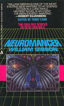 Neuromancer is a 1984 novel by William Gibson. The novel tells the story of a washed-up computer hacker hired by a mysterious employer to pull off the ultimate hack. The book cover created by Rick Berry in 1984 was the world's first digitally painted book cover. This book cover was new to people because it was digitally painted. This book cover was probably impressive to people in 1984 because they didn't have all of the computer technology that we do today, so creating this book cover took talented and technology. This book cover probably isn't anything special to people now a days, but back then it was. As soon as I look at this book cover I think of cyberspace and science. It kind of has a Star Wars feel with the yellow lines and the title going into space. I like the image of the purple person. Just seeing this book cover makes me want to open it up to see what it's about. I like the quote at the top of the book cover. The quote gives a little more information on the author than the book cover does and I think that will make people open the book more. I like that he took the pink color from the font and put it in the pink bar behind the picture. I have to create a book cover for this book, the "Neuromancer" using only text. I am doing research on the book cover and the book itself, so I can more accurately design the book cover. It's harder to create a book cover out of text because there is no images that people can look at. If I want to create an image I have to do it out of text.
Monday, February 25, 2013
Steve Jobs Portrait-Dylan Roscover

This is a potrait of Steve Jobs designed by Dylan Roscover. Dylan has also designed a portrait of President Obama and many other people and products. Dylan went to Full Sail's University for the Digitial Arts & Design Bachelor's Degree Program. He used text from the famous "Here's to the crazy one's" ad campaign in the 90s. He used a variety of Apple-related fonts: Motter Tektura, Apple Garamond, Myriad, Univers, Gill Sans, and Volkswagen AG Rounded. This is absolutely amazing. I have made people/faces out of type before, but nothing as good as this. One of the reasons he got it to actually look like a face is because he rounded the type where it needed to be like on the cheeks and forehead. Some of the type is more straight like on the lip and the beard. He also made some of the text small and some of the text big. This is an example of visual hierarchy. The first few words I see are "crazy ones" and then when I look more I see the whole phrase "Here's to the crazy ones." I also see the words misfits, troublemakers, human, Steve Paul Jones, and the square holes. I didn't noticed it at first, but they is a low opacity Mac logo in the background. I also like the color scheme of this piece. It's like a blue, gray, and white color scheme. I am currently designing a flyer for my typography class and I have to use 90% type to design my flyer.
Hidden Truth Poster
 This poster was done by Christina Koehn at the University of Washington, USA. I like how the type in this poster is angled. I am creating a music festival flyer with angled type in my typography class. I like how the words "Hidden Truth" look hidden. It took me a while to figure out what it actually said. I like the concept of trying to hide the words hidden truth, but I don't think it works that well. It looks like she randomly put 3 lines of text in the word hidden truth. I don't understand why there is such a big gap between the H and the I when the size of the text isn't that big. Unless she was trying to show that the words were coming down and on top of the words. The text at the very top next to the 06 is small. She should have made the type bigger since she now as all this dead space at the top. I have no clue what the giant 06 means in the corner. I like the concept of this poster, but I think it still needs some work done to it.
Tuesday, February 19, 2013
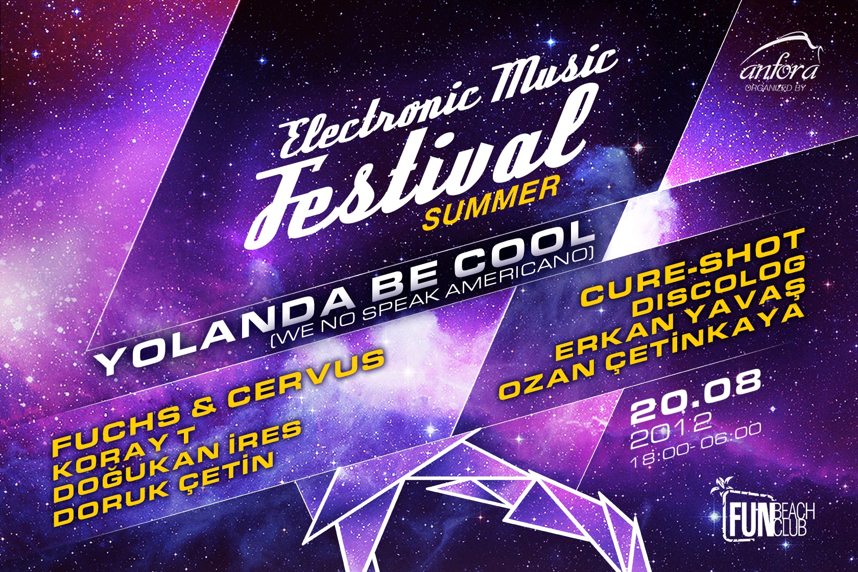
StockHolm Rock-Out Flyer
 This is the 2010 Stockholm Rock-Out Music Festival's flyer. It is a big metal music festival in the summer. I think the music festival is held in Switzerland. I don't really like the design of this flyer. It doesn't scream metal music. All they did was put the logo/type fonts of the bands that are playing in the center of the flyer. We all know that centering a design is too boring and not interesting. I guess if this is the official flyer of the music festival they have to use the same type faces of the bands that are playing. I think they could have been a little more creative in designing this flyer. One thing that would make it more interesting is having it off center. I think they should have made the date bigger because it's hard to read and it's too close to the title. I don't think the background fits the metal music festival. I think they should have a different background. I also think this flyer is too crowded. I know music festival flyers are supposed to have a lot of information on it, but I don't like how they designed this one. I am designing a electronic music festival flyer in my typography class now. I am looking at other music festival flyers to get some ideas of what to do and what not to do. This is a metal music festival flyer and when I look at the flyer it doesn't say metal music festival to me.
Thursday, February 14, 2013
Electronic Music Festival Flyer
Subscribe to:
Comments (Atom)