 This is an interesting book cover. It is a very dark cover. It's by Helen Campbell and it was copyrighted in 1883. I like that they have the word "charades, "wax flowers," "woodcutting" and other words in the ribbon coming out of the pocket watch/circle. It tells you a little about the book. I also like the decorative "A" in American. It doesn't look like a girly book at all, but I think because it was made in the 1880's they didn't have much color or printers that we do today, so black was probably one of their few choices. It looks like a lithograph print. There is some typography in the actually title. Even though they used the same font the words are varied. I like how "Home" is curved and how the "y" in play is holding a bag. The only thing I don't like how the title is positioned/angled is that it doesn't read right to me. When I first read it I thought it said "Home of Book Work and Play" or "Home of Work and Play Book." The title is supposed to be read like this "American Girls' Home Book of Work and Play." One solution to fix this problem is to move "of" to the other side of "Book." It looks like they used 3 fonts, which is usually the maximum for a book cover or poster design. I am currently designing a book cover and I have to design it all out of type. I am playing with angles right now.
Monday, March 11, 2013
American Girl's Home Book of Work and Play
This is an interesting book cover. It is a very dark cover. It's by Helen Campbell and it was copyrighted in 1883. I like that they have the word "charades, "wax flowers," "woodcutting" and other words in the ribbon coming out of the pocket watch/circle. It tells you a little about the book. I also like the decorative "A" in American. It doesn't look like a girly book at all, but I think because it was made in the 1880's they didn't have much color or printers that we do today, so black was probably one of their few choices. It looks like a lithograph print. There is some typography in the actually title. Even though they used the same font the words are varied. I like how "Home" is curved and how the "y" in play is holding a bag. The only thing I don't like how the title is positioned/angled is that it doesn't read right to me. When I first read it I thought it said "Home of Book Work and Play" or "Home of Work and Play Book." The title is supposed to be read like this "American Girls' Home Book of Work and Play." One solution to fix this problem is to move "of" to the other side of "Book." It looks like they used 3 fonts, which is usually the maximum for a book cover or poster design. I am currently designing a book cover and I have to design it all out of type. I am playing with angles right now.

Friday, March 8, 2013
The Brand Gap
 (I first saw this book in class)The Brand Gap is a book by Marty Neumeier. This book is about brand-building. This book cover is made out of all text. There are some problems with this design though. When I read it I read it as "The" "Bra" "ND" "Gap." The designer should not have separated the word brand between the a and the n because it reads as bra. The thing that really bugs me is that the n is flush with the p, but the a is not flush with the other a. That cliffs throws the design off. It would look much better if they made the a flush with the other a. The "How to Bridge..." section is supposed to be falling in the gap, which is a cool idea, but it doesn't work. If I was to drag those words through the gap it would not fit. I think they should adjust the words to make it fit in the negative space (gap) and move them down a little, so it looks like they are falling down the gap. I do like how Marty Neumeier in "A White Board Overview By Marty Neumeier" is black and the rest is white. This is a decent example of a book cover made out of type, but it needs some adjustments. I am currently designing a book cover and it has to be made out of all type.
Tuesday, March 5, 2013
English Book
 This is an English book cover. This cover is made out of all text. The tracking and leading are very tight. They are so close together that all of the letters are overlapping except the "r." I like the dark blue that the letters make when they overlap. Even though the letters are the same color when they overlap they make a different shade of blue. I know words/letters aren't supposed to be tight to the edge, but I think it works in this cover because the words are actually going off the page. The cover is a interesting concept, but I don't think I would use this for an educational English book. I have to think about tracking and leading when I'm designing my book cover.
IMperfect Enjoyment
 The Imperfect Enjoyment is a book by Dewan W. Gibson. The front book cover is mostly made out of type. When I first looked at it I thought it said, "I'm perfect...enjoy...ment. Then I looked at it and realized it said The Imperfect Enjoyment. This is a good use of weight, scale and color variations in text. I like that the put "the" in the "I"in IM. It makes the word the word "the" not as important. It's a little top heavy, but I think that the size and the placement of the text below it balances it out. I like how each line is different. I also like the picture inside the text "Perfect Enjoyment." I didn't noticed it at first, but when I looked at it closer I saw that there is an image of a woman. This is a good example of visual hierarchy. This is something I need to keep in mind when I am designing my book cover for my typography class. I also like how the designer used the space in the spine to put the title and author in it. I also like how the back is designed. I like that they brought in the bathing suit bottom from the front. I also like the quotes on the back cover. I think using 2 different colors on the back cover helps separate the information and it makes it more interesting. I think this is an interesting book cover design. I have to design a book cover made out of only text.
Sunday, March 3, 2013
Chaos
 This book is also by James Gleick. It's the best-selling book by Gleick that first introduced the principles and early development of chaos theory to the public. As soon as I look at the book cover I think of chaos. Even though it says chaos it also says chaos another way because of the way it's designed. The letters in chaos are slanted and it looks like they are falling. Because they aren't in a straight line it makes people look at the word longer. The background also gives a chaos feeling. The background has swirls and different colors in it. I like that there is a swirl in the opening of the "C." I'm not sure if they did that on purpose or not, but it looks really cool. I like the 2 blurbs on the cover. The white circle that says "Making a New Science" gives readers a little more information and I think that helps the book cover. I know that this book cover isn't completely designed in text, but the title of it is. I have to make a book cover only using text and this book cover gave me some ideas on what I can do with the text. I can make words/letters slanted or going different ways to convey a certain feeling or mood.
The Information
 The Information: A History, a Theory, a Flood is a book by science history write James Gleick. This book cover is clearly made out of only text. This is a good example of repetition, visual hierarchy, and color. He repeated the same words over and over again. On the first column he repeated the word, "The Information," but the second word is in red. He has the word, "A History," towards the bottom. In the second column he repeated the same thing, but he also added the words, "A Theory." and "A Flood." He kept those words black. The last column he repeated "By James Gleick" and "Author of Chaos." He made two of the words red. When I look at this book cover the first things I see are The Information by James Gleick Author of Chaos, so it actually reads as a title. Then I see the other words in black. I think the designer of the book cover did a good job with visual hierarchy because the red words are what directs people's eyes to the book cover. I like that they didn't make A History, A Theory, and A Flood in red. I think they look better in black because it makes people look at the cover longer to find those words. I also like that the designer used the spine as extra space. It repeats the title and the author and it also has one word in red. The designer definitely used repetition in designing this cover. I would probably open this book to see what it's about. This gives me some inspiration when I am designing my book cover for Neuromancer. I have to design the cover using only text.
Neuromancer Book Cover
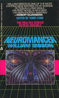 Neuromancer is a 1984 novel by William Gibson. The novel tells the story of a washed-up computer hacker hired by a mysterious employer to pull off the ultimate hack. The book cover created by Rick Berry in 1984 was the world's first digitally painted book cover. This book cover was new to people because it was digitally painted. This book cover was probably impressive to people in 1984 because they didn't have all of the computer technology that we do today, so creating this book cover took talented and technology. This book cover probably isn't anything special to people now a days, but back then it was. As soon as I look at this book cover I think of cyberspace and science. It kind of has a Star Wars feel with the yellow lines and the title going into space. I like the image of the purple person. Just seeing this book cover makes me want to open it up to see what it's about. I like the quote at the top of the book cover. The quote gives a little more information on the author than the book cover does and I think that will make people open the book more. I like that he took the pink color from the font and put it in the pink bar behind the picture. I have to create a book cover for this book, the "Neuromancer" using only text. I am doing research on the book cover and the book itself, so I can more accurately design the book cover. It's harder to create a book cover out of text because there is no images that people can look at. If I want to create an image I have to do it out of text.
Subscribe to:
Posts (Atom)